
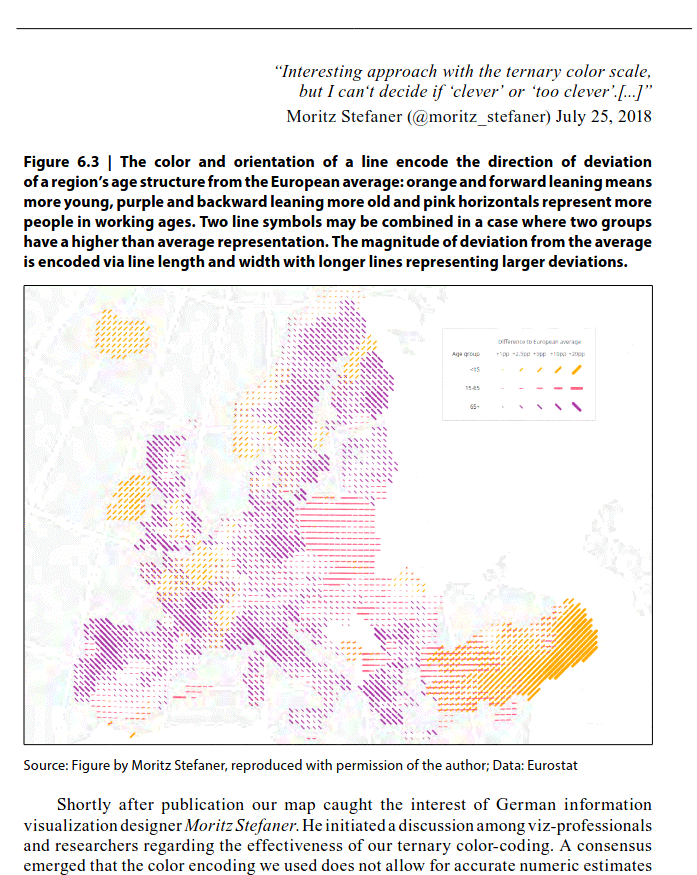
In the days following the publication of ‘Regional population structures at a glance’ (Kashnitsky and Schöley, 2018) we were busy participating in the discussions of our article’s main figure (reproduced in Fig. 6.1) on social media. Various groups were sharing their thoughts on the colorful map of Europe showing the population age-structure on a regional level publicly discussing topics like European immigration, abortion legislation in Ireland, Italy’s low fertility, East-West migration in Germany and more. Meanwhile designers and visualization researchers debated the question ‘clever or too clever?’. The hundreds of comments we received post-publication gave us plenty of opportunity to reflect on our design. In this essay we want to explain the design choices we made during the creation of the map, explore and discuss alternative designs and evaluate our visualization against the goals we had when starting this project.